


Introduction
If takeout sundaes and shakes are your bread and butter, the right custom ice cream cups can quietly do heavy lifting for recognition, speed, and shareability. In this guide, you’ll learn how to choose the right size mix and lids, pick compliant materials, set up print‑ready artwork for tapered cups, avoid proofing pitfalls, and use on‑cup branding to spark social posts. This article is written for U.S. ice cream shop owners and managers who want vendor‑ready specs and fewer surprises. By the end, you’ll be able to brief suppliers clearly, prevent print errors, and create cups people remember—and photograph.
Choose your size mix and lids
Map servings to cup sizes
For a takeout‑heavy model, most shops settle into an 8/12/16 oz trio. It covers classic sundaes (8 oz), indulgent builds with multiple toppings (12 oz), and shakes or shareable sundaes (16 oz). If you sell thick shakes or tall whipped‑cream toppers, plan for dome lids on 12 and 16 oz. Flat lids are efficient for sundaes with minimal height and for back‑of‑house preps. A small 4–6 oz option can be useful for kids’ sizes or sampler flights, but don’t let it complicate your lid program unless you truly need it.
Standardize rim diameters and lids
Your storage space and service speed improve dramatically when multiple cup sizes share a lid. Many suppliers sell families built around shared rim diameters like 96 mm, sometimes spanning 8/10/12—and even 16 oz in certain lines. Because rim specs vary by manufacturer, always verify with samples and compatibility charts. Several vendors publicly note these patterns—e.g., 96 mm lid families across popular sizes—while also warning that some 16 oz variants use 90–92 mm rims. Use sample cups and lids to validate a clean snap fit and no warping. For reference on these patterns and why they vary, compare vendor compatibility notes such as the 96 mm families highlighted by suppliers and the separate 90–92 mm usage others document in their listings, including the rim variability examples from WebstaurantStore’s 16 oz cup spec and ePackageSupply’s lid size overview.
Plan SKU simplicity and storage
Here’s the deal: the fewer rim families you stock, the faster your team moves. Aim for one dome lid and one flat lid per rim size and keep rim variants to one—two at most. Standardization lets you buy lids deeper, reduces mis‑pulls during rushes, and keeps back‑of‑house shelving clean. Label every lid case by rim diameter and style, and store the corresponding cups directly below to make restocking foolproof.
Materials, linings, and compliance for custom ice cream cups
Paperboard, coatings, and PFAS‑free
Most custom ice cream cups use SBS (solid bleached sulfate) or similar food‑grade paperboard, paired with a barrier such as PE or PLA to resist moisture and fats. Because dairy is fatty, ensure your materials are suitable for fatty food contact under U.S. regulations. Paper components for food contact are regulated in 21 CFR Part 176; the section covering paper in contact with aqueous and fatty foods is detailed in the FDA’s rules at 21 CFR §176.170. See the FDA’s overview of Food Contact Substances and the legal text in the eCFR Part 176 for paper and paperboard components for primary details.
As of 2026, many U.S. states restrict intentionally added PFAS in food packaging, and several specify fluorine thresholds for enforcement. For example, Washington State added a 50 ppm total fluorine presumption in certain categories (2026), while California’s program ties requirements to total organic fluorine under AB 1200. Legal and industry roundups such as Packaging Digest’s PFAS regulation overview help operators track evolving state rules; always confirm specifics with your supplier documentation.
Compostable options and valid claims
If you’re exploring compostable linings (e.g., PLA), use claims carefully. The FTC’s Green Guides expect “competent and reliable scientific evidence” and clear disclosure about conditions (typically industrial composting). For coated paper cups, BPI certification (ASTM D6868) provides third‑party verification and prohibits intentionally added PFAS while enforcing total organic fluorine limits; BPI’s FAQ and listings let customers verify live certificates. Avoid vague “eco‑friendly” language and stick to precise, verifiable claims on the cup and your website.
Single vs double wall for service model
Single‑wall cups handle most frozen applications, especially for quick hand‑offs. Double‑wall construction adds insulation and a more premium hand‑feel; it can also help with condensation if your shop sees complaints during hot, humid months or with shakes that linger in transit. If you do a lot of freezer staging, test both constructions for surface softening or set‑off after a freezer‑to‑ambient cycle so your print finish remains crisp.
Printing, color, and artwork setup for custom ice cream cups
Digital vs flexo and when to use each
Under 3,000 units per design typically points to digital printing. You avoid plate costs, you can move faster (often in the 7–15 business‑day window, pending capacity), and you can tweak artwork between batches. For higher volumes, flexographic printing drives unit costs down but adds plate/setup steps and longer timelines, commonly measured in several weeks. Public benchmarks reflect these trade‑offs: short‑run specialists share design prep and short‑run guidance, while U.S. product pages cite flexo‑style MOQs and multi‑week lead times that help you plan around plates and schedules.
CMYK with Pantone matching strategy
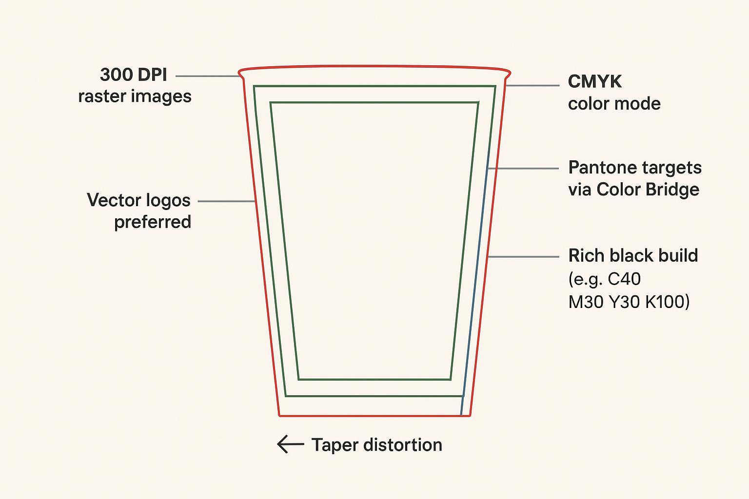
For short runs, build your files in CMYK and treat Pantone numbers as targets, not guarantees. Ask your printer whether they simulate Pantone via CMYK or use an extended‑gamut set; either way, expect small deltas compared with true spot inks. If a brand color is critical, request a hard proof on similar stock or a contract proof that sets expectations for ΔE tolerances. Pantone Color Bridge references are a practical way to see how your Pantone shade maps into process values before you approve.
Dielines, bleed, DPI, and safe zones
Taper changes everything. Always start with your vendor’s dieline, not a generic shape you found online, because rim curls and seam overlaps differ by machine. Follow these principles:
- Bleed: 3–10 mm depending on the vendor; lean toward the high end near the seam to avoid a sliver of white at trim.
- Safe zone: Keep logos and small type 5–10 mm inside the trim, and avoid straddling the seam with critical elements.
- Resolution: 300 PPI for raster images at final size; keep logos and line art in vector (AI/EPS/PDF) to ensure sharp edges.
- Seam handling: Extend backgrounds through the overlap; straight stripes and grids can look crooked on a cone, so either avoid them or pre‑warp gently so the on‑cup result reads straight.
- Black builds: If you need a deep black on uncoated stock, ask your printer for a recommended rich black build to avoid set‑off.
For a concise walk‑through of artwork expectations, design primers from specialty cup printers, such as CupPrint’s layout tips, reinforce why vendor‑specific dielines matter.
File handoff and proofing workflow (educational example)
A practical, low‑risk handoff looks like this:
- Package your file: AI or press‑ready PDF in CMYK; outline or include fonts; embed linked images; include the vendor dieline as a locked template layer and provide a layer showing your intended trim and safe zones.
- Transfer securely: Use your supplier’s upload portal or a secure file‑transfer method (SFTP or an approved DAM). Include a checksum or version number in the filename so you and prepress can track revisions.
- Soft proof: Approve an annotated PDF proof for layout, dieline alignment, seam placement, and text accuracy. Remember: on‑screen proofs are not color‑accurate.
- Optional color proof: For color‑critical work, request a hard proof on similar stock or a contract proof that sets expectations for ΔE tolerances.
- Sign‑off and archive: Approve, then archive the final proof, dieline version, and any Pantone/CMYK targets so reorders are consistent.
Disclosure: The workflow above mirrors what many vendor portals and secure transfer tools support. You can accomplish the same with common alternatives (e.g., your printer’s portal, SFTP, or a cloud DAM) without locking into a specific product.
Proofing, MOQs, costs, and timelines
Proof types and color checks
Proofs aren’t all equal. A soft proof (PDF) is essential for content, dieline alignment, and seam placement, but it won’t guarantee color. If your brand palette is sensitive, add a hard proof printed on similar stock or a press check for plate‑based jobs. For Pantone targets, ask how the printer will simulate or mix the ink and what tolerance they’ll aim for.
Typical MOQs and lead times
Expect digital runs to start anywhere from a few hundred to around 1,000 units per design, with many shops quoting roughly 7–15 business days after proof approval. Flexographic jobs usually begin in the 5,000–50,000+ range and take several weeks once plates are made and a slot is scheduled. Publicly posted U.S. product pages and timelines for custom paper cups reflect these bands and are a good benchmark as you plan launches; see an example of flexo‑style MOQs and timelines from a U.S. seller.
Cost drivers and optimization
Your unit price is a function of substrate weight, barrier (PE vs PLA or specialty coatings), coverage and number of inks, finishing, lids, freight, and the print method. Digital eliminates plates but can cost more per unit; flexo adds plate and setup fees but drops the per‑unit price at volume. If you plan seasonal art, consider batching approvals and running designs back‑to‑back to minimize downtime. For short runs, limit full‑bleed heavy coverage to keep costs in check and reduce risk of scuffing on uncoated stocks.
Visual hierarchy and legibility on‑cup
On a conical surface, clarity beats cleverness. Use high‑contrast color pairs and set your logo large enough to be read at arm’s length. Keep small copy at 6 pt or larger on uncoated stock, and avoid placing fine details near the seam or the steepest taper. Establish a clear reading order: logo or icon first, short tagline second, URL or handle last—kept safely inside the zone where curvature won’t distort it.
QRs work when they’re easy to scan. Use a minimum of about 2 × 2 cm for close‑range packaging, increase size for curved surfaces, and leave a quiet zone of four modules on all sides. A simple rule of thumb is the 10:1 distance ratio—if you expect scanning from 20 cm away, size the code near 2 cm. Keep contrast high and avoid reflective varnishes over the code. Pair the code with a tight call‑to‑action and a branded hashtag, and route to a dynamic short link so you can update destinations and measure scans. Practical guidance from standards‑oriented resources such as Delivr’s QR printing guidelines (10:1 rule) and GS1 general specifications references on quiet zones back these parameters.
Seasonal runs and limited editions
Digital printing makes it painless to test limited‑edition art for holidays, local events, or collabs. Add a small “available through” date near the seam so staff know when to sunset stock, and treat seasonal runs as mini‑campaigns—track sales, average ticket, and UGC volume to decide which designs deserve a reprint.
Operations and quality checks
Lid fit, condensation, and finish
Before committing, run a fast in‑shop battery of tests: fill with water and snap on each intended lid (flat and dome). Check for a clean, even seal, then do a few shake and brief inversion tests over a sink. Move samples from freezer staging to ambient and watch for condensation, surface softening, or print set‑off. If issues appear, discuss double‑wall options, barrier tweaks, or finish changes with your supplier.
Receiving, storage, and FIFO
On receipt, spot‑check rim diameters, height, and base size against the vendor spec; rim consistency is what keeps lids snapping cleanly. Store cases in a dry area away from floor moisture and direct heat, keep stacks below the weight that deforms rims, and run FIFO so older lots move first. Record lot numbers alongside your proof approval date so you can trace any issue to a batch.
Compliance documents and audits
Ask vendors for Declarations of Compliance tied to the intended use (fatty foods), PFAS statements or recent total fluorine test reports where applicable, and BPI certificates for any compostable SKUs. The legal backbone for paper food‑contact components is laid out in the FDA’s rules for paper and paperboard substances; see FDA’s Food Contact Substances overview and the eCFR Part 176 text. Compostability and PFAS‑related claims are supported by certification bodies and state rules; verify active certificates on BPI’s listings and monitor policy updates via Packaging Dive’s Green Guides coverage.
Conclusion
Right size mix, compliant materials, accurate artwork, and consistent proofing discipline—that’s the playbook for custom ice cream cups that actually work in a takeout environment. Confirm your lid‑sharing family, select a barrier that stands up to dairy and staging, build artwork on the correct dieline with generous safe zones, and choose the print method that matches your real volumes and timing.
Next steps: confirm dielines and rim specs with your vendor, run a small digital pilot across your 8/12/16 oz set, hard‑proof any color‑critical art, and track sales plus UGC scans. Use that data to decide which designs scale—and which become your next limited edition.